Slide printing on RA-4 paper using reversal processing
Arthur Brainville (Ybalrid)
- 17 minutes read - 3489 wordsSlide film is something amazing. The colors and contrast is like nothing else. We can be happy that products like Ektachrome, Velvia, and Provia still exist today (and I surely hope that fujifilm will continue producing Velvia).
The result is obviously intended for projection. Although it was possible to make paper prints of slides.
Note the past tense. Because in 2026 you cannot use a well defined process do an analog optical print of a picture shot on slide film into a piece of paper in a darkroom.
The last process of this sort that was doable, was the legendary “Cibachrome” (renamed to Ilfochrome). In the 2010’s the company that made it stopped manufacturing the paper and chemicals for it.
Kodak had a process like this, but it also vanished.
Since you can print negatives via the RA-4 process, and if you know how slide film is actually developed too as a reversal process, you can guess that there’s a hack still available if one wants to try it…
Note: I should point out that this is probably not the practical way to print a slide nowadays. You should instead try to make an internegative if you want to do it in the darkroom. Portra 160 rated at ISO 100 and processed for 3 minutes only (which results in a small pull process) has been a recommended way.
Or, make a digital scan then use a printer. That works too. but where’s the fun in that?
How?
This is called RA-4 Reversal, and the basic principle is akin to all types of reversal processing. The latent image exposed from a positive (a slide in the enlarger, although it is popular to shoot the paper in camera too with this method) will be a negative.
The negative is first developed, in a black and white developer. This will create an image made fully of silver, and not of dyes. Crucially, this means that the undeveloped part of the image correspond to a positive.
The paper is then exposed to even and continuous white light for some time, to fully fog all areas of the positive. This will allow the reverse of the negative to be subsequently developed.
The paper is then processed like a regular RA-4 paper print. The color developer not only reduces silver halide into silver like usual, but it also will locally combine with the dye couplers in the emulsion to form the cyan, magenta, and yellow dyes of the print.
The blix (a combined bleach fix) re-oxidizes all the silver on the paper (the exposed negative by the enlarger, and the re-exposed positive) into a silver halide, that can be dissolved away by the fixer. And this process does not affect the dyes, that are only developed from the reversal exposure.
The result will naturally be the negative of the negative, which is a positive.
The naive approach
If you do any amount of both black and white and color printing, you have everything needed. In my first ever attempt at doing such process, I simply used all the chemicals from a Bellini RA-4, and added to the kit ILFORD Multigrade developer. (I regularly use a stop bath for RA-4, see my RA-4 paper development notes)
The color correction for the print works exactly the same as RA-4 but in reverse: For each time you would want to lower or increase one color filter, go the opposite way. The filter pack values will be vastly different than usual, because there is no orange mask on the slide. I do not feel it is necessary to knock down this difference by putting a bit of C-41 film in the negative holder, but I have seen it done for other purposes. If you feel that helps, go ahead and do that too.
For my first ever test, I decided to not want to deal with temperature differences (probably a mistake), and used the following development process
First development:
- Pre Wet
- Black and white developer 45 seconds
- Stop
- Rinse
Reversal:
- Pull paper out of the tank, exposing to regular room light for a minute
- Put back in the tank
- Color developer 45 seconds
- Stop
- Blix 45 seconds
- Wash
I did this with this Ektachrome, which was a relatively “tame” (contrast-wise) picture of a flower.
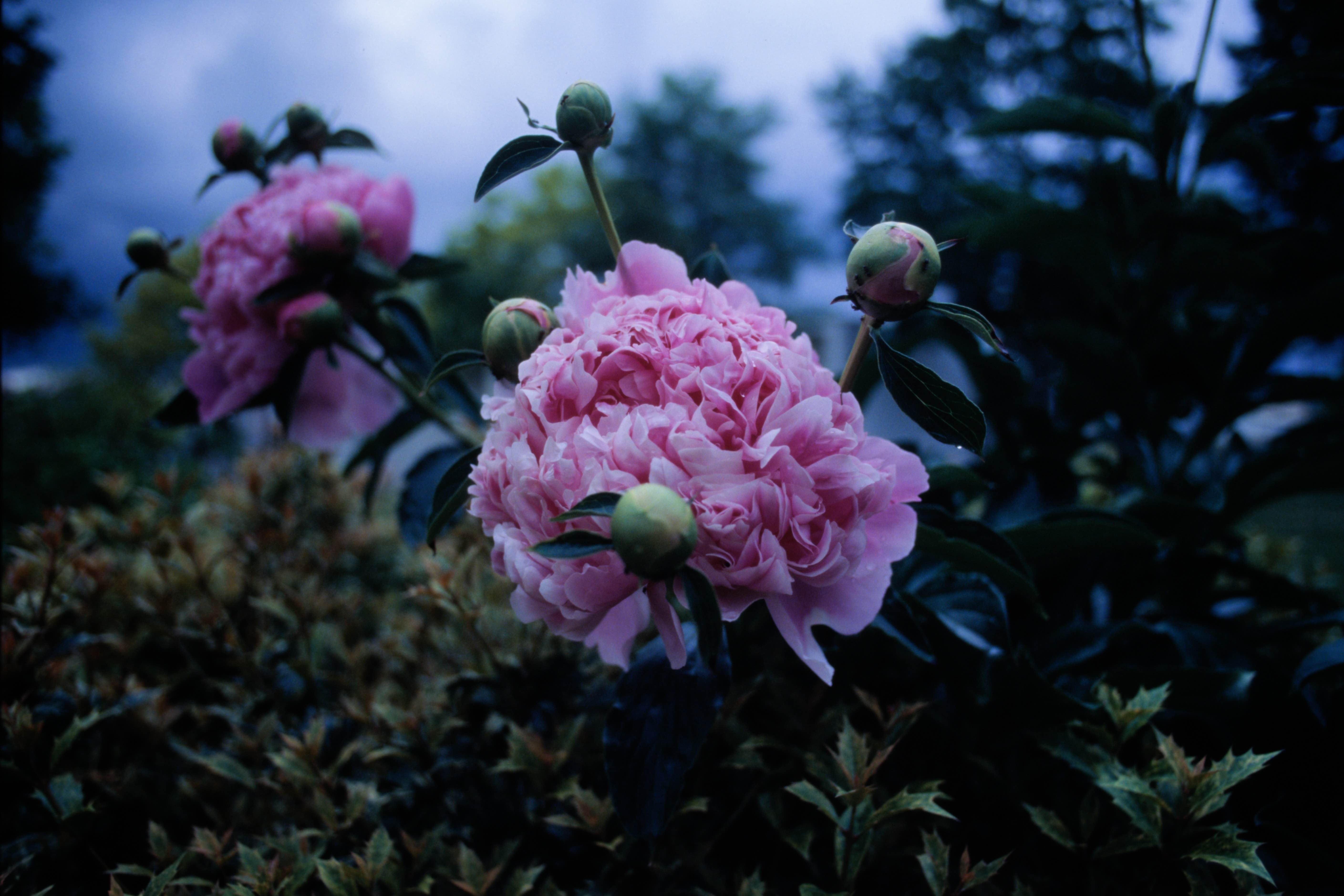
Here’s the result.
The highlights here are blown out, but this is the level of exposure required to get any amount of details on the shadows
But this demonstrates that it is possible to reproduce the hues and values of the colors of the original slide on modern color printing paper.
The main problem of this process is the amount of contrast that ends up on paper.
The rest of this article is really about fighting the contrast dragon.
The contrast problem
There is a contrast mismatch between the slide and the paper. Which results in
First Developer
One of the ideas to obtain less contrast, is to lower the contrast built by the 1st developer.
It makes sense since the actual tonal range of the reversal result is the opposite of the density built up by this developer.
On top of that, RA-4 paper is a relatively low silver content paper. So you will want to have a lower activity developer for it.
You could dilute multigrade developer. But I got the idea from Jeff Neale to use a developer formulated for lower contrast. It is Beers’ two part developer.
This is an interesting B&W darkroom print developer that comes in 2 solutions. you mix a ratio of these solutions to affect the print contrast.
I am not a chemist, but if you were to mix both solution in the same ratio, you will get something that looks like a typical MQ black and white developer. (Metol + Hydroquinone formula).
It seems that Metol develops lower contrast and Hydroquinone develops higher contrast. The solution A of the developer is the metol-only one. A 1:1 dilution of this developer with pure water is the 1st developer used in all my subsequent tests.
The difference between my method and Jeff’s is that I am only processing the paper for 45 seconds instead of the 1:15 minutes described in the article on silvergrains classicˆ1
- Water 750ml (50 C/125F)
- Metol 8g
- Sodium Sulfite 23g
- Potassium Carbonate 21g
- Potassium Bromide 10% solution, 11ml
- Water to make 1 litre
To make the developer, start by mixing a 10% solution of potassium bromide (KBr). This dissolves fine in room temperature water in my experience.
Then, heat up 750ml of water (ideally distilled), and add each ingredient into the warm water and stir up until all solids are dissolved. Then add the required quantity of KBr solution. Complete the volume to a liter and let it cool to room temperature.
From this solution you can prepare a working solution by diluting it 1+1 with water.
Follow the same development steps as before, but replace Multigrade developer with the one we just made.
The change is far from being dramatic. And I suppose we could make this developer softer by diluting it further. Or increasing the Bromide or Sulfite content (they act as a restrainer. The later also being a so-called silver solvent and preservative in this mixture), or lowering the accelerant (Carbonate).
Color Developer
It is generally possible to lower the contrast of a RA-4 print by adding Sodium Sulfite to the color developer.
This is because this chemical will compete with the dye couplers in the emulsion to combine with the oxidized color developer (if I understand correctly).
This generally has the effect of raising the black point on the printed image.
To note that, doing this to RA-4 color developer spoils it. You should do it only to a small quantity of developer. As discussed in my RA-4 paper development note, I use rotary drum processing. I need only 75ml of working solution to develop one sheet of 8x10 color paper.
The sodium sulfite is extremely active at doing this, and shall be diluted in a stock solution and added at very small quantities to the developer just before processing. Probably measured with a syringe. This method is discussed in the youtube video in the 2nd link in #References
I must say that I have not really applied this means of contrast reduction to my RA-4 reversal printing adventure. This will have the effect of lifting the blacks, as we’re on the 2nd development here. This reduces the Dmax and probably knocks down the best thing about these reversal prints. I am not a fan of this personally.
You can see this effect tested a bit more thoroughly in this post I made on Reddit some time ago
Pre-flash
Pre-flashing is the process of partially fogging the paper, so it is able to register details with a lesser amount of exposure. If exposing the paper is like pushing a car up a hill before it builds up any amount of density, the pre-flash is like bringing the car further up, so your exposure has less to do.
The case of the reversal is interesting because in this case, the part of the image that receives the most light is the part of the image that is the lightest on the print. The general wisdom and methodology is reversed.
Pre-flashing in this case will affect your shadows and not your highlights. If moderate enough, it should not affect the actual blacks enough to be an issue (unlike the sodium sulfite based lifting discussed before). This is an idea I got from Jeff Neale’s process. I will detail how to find pre-flashing parameters easily.
It does not differ much from the general advice of color preflashing, that is demonstrated by Gregory Davis in the 3rd #References. The differences are as follows:
- You should not put a piece of orange color mask in the enlarger head, because we are not basing our filtration on this compensating mask being there when printing from slides
- You should still find settings that gets you a middle grey filtration, at medium density
- More exposure gets the paper lighter not darker, do not forget this when making test strips!
- The point you try to find is the point where the paper becomes “lighter than absolute black”, rather than “darker than absolute white” for the reason mentioned above.
Finding those parameters is a bit of a 2 step process:
- Find the filter pack that gives you grey from an exposure with no film in the enlarger
- Find the exposure that gives you no change of density on the paper.
The 1st point can be eyeballed with the help of a grey card. The 2nd point is harder to do by eye and a black and white densitometer can help figure out how black the black paper is, because your test strip will ultimately look like a very black piece of paper.
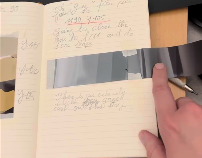
To find the medium grey, doing test strips of different filtration levels, followed by test strips of different exposures at the chosen set of filters is the way I found to get close to the result without pulling my hair too much. Taking copious amounts of notes to not lose track of these settings.
You should start by trying to eliminate any “magenta or green” and “red or cyan” cast first. It is then a lot more productive to move in the “orange / blue” axis of the color wheel.
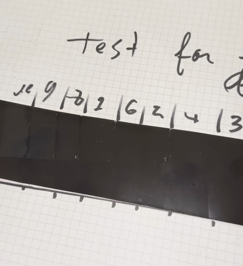
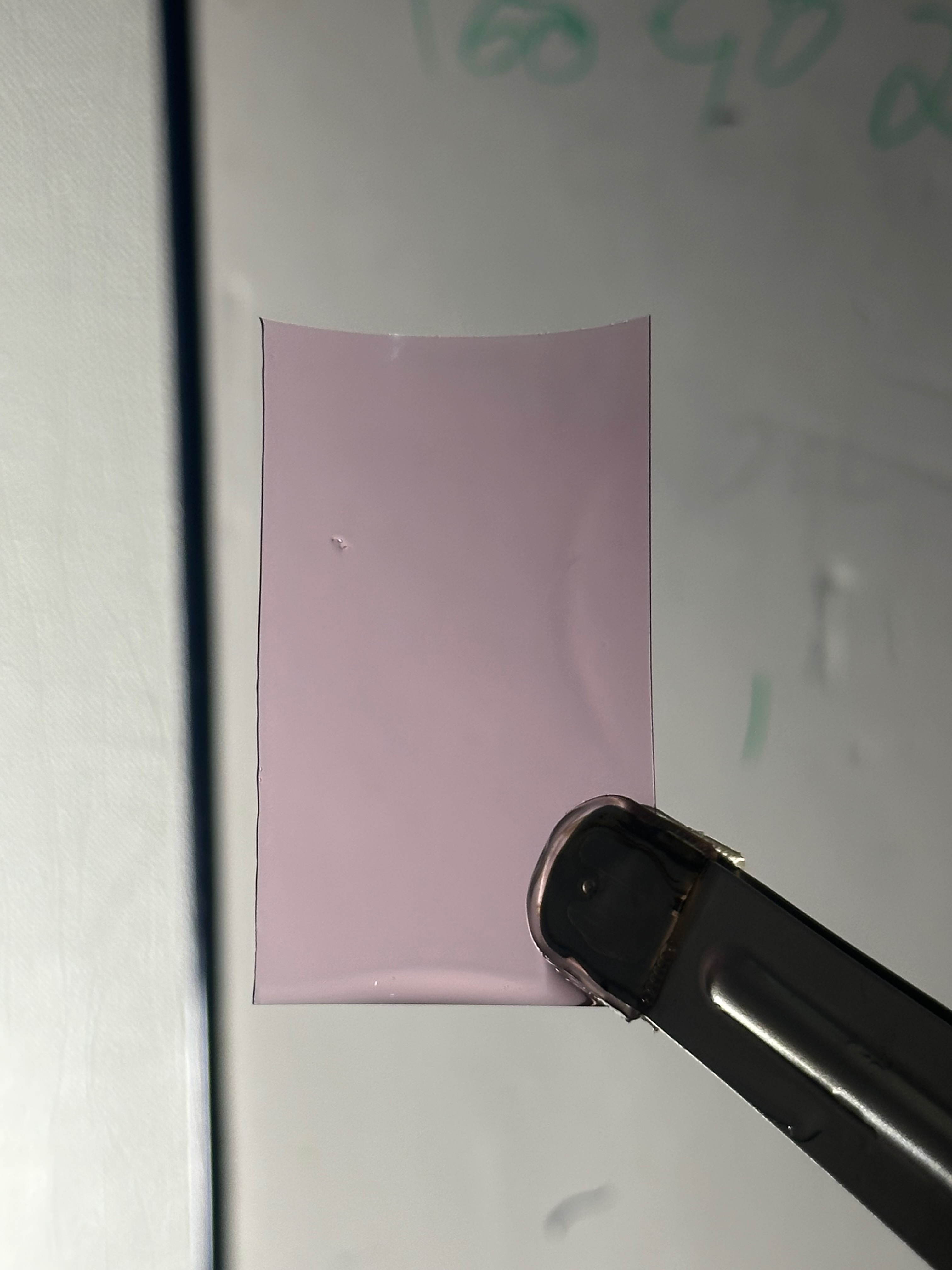
Do not trust the iPhone pictures I show here, especially since I paste my bits of paper in a cream colored notebook in this case. This last strip was a pretty good version of “grey” to me, under a “daylight” LED bulb with good CRI.
Because those boundaries are very hard to see, I suggest making large enough test patches, and attempting to mark their edge with a black sharpie while you are exposing the test strips.
You can then expect the black sharpie to resist the 1st developer “enough” so you can still see it. During the re-exposure you can report back those lines on a piece of paper, that you will be able to re-index the test strip against.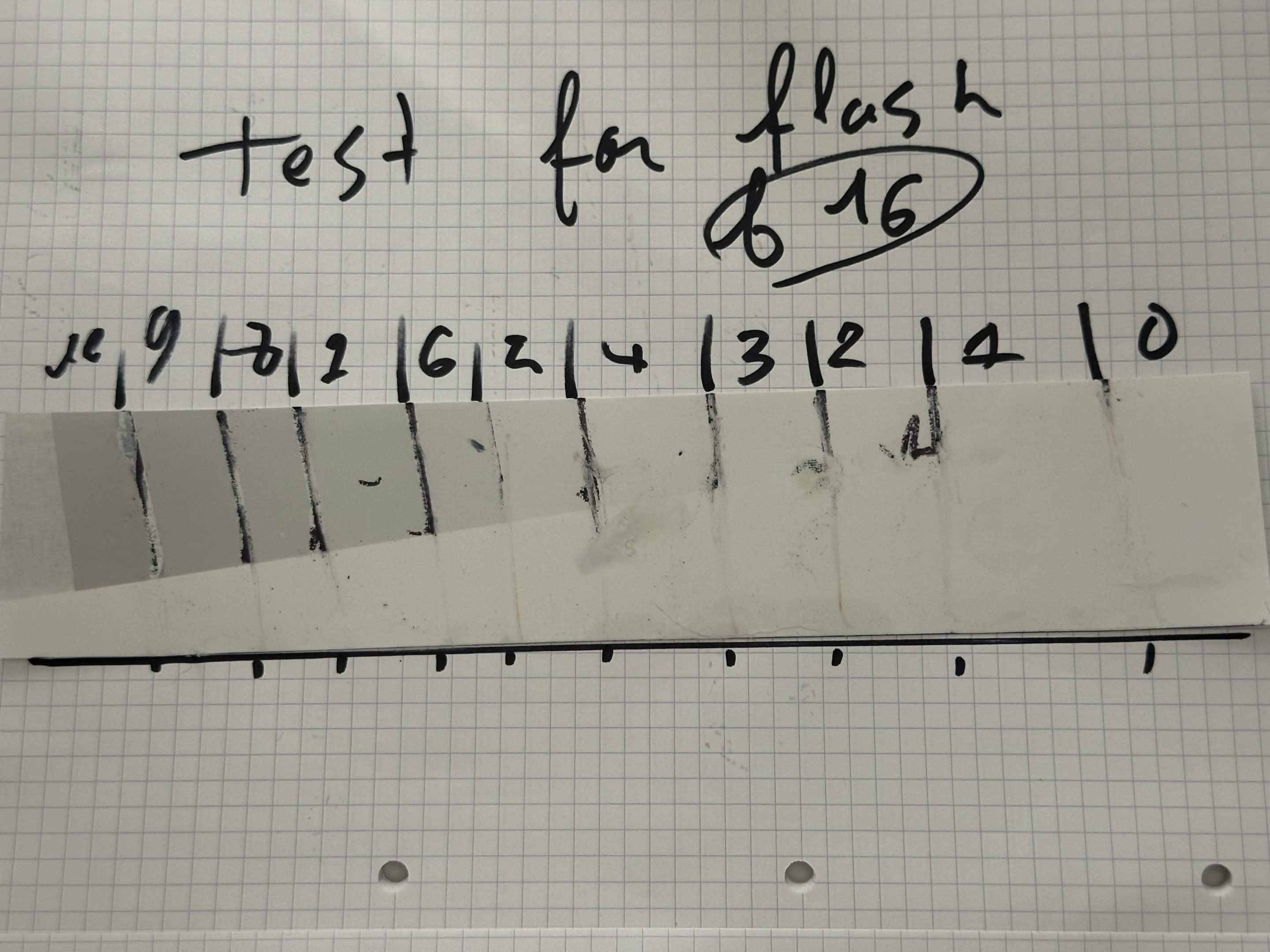
Aligning the paper with the black line at the bottom will allow finding the edges of these patches. To note that this was relatively messy, one should try not to touch the actual emulsion at this point.
It is sort-of possible to see already that between 2 and 3 in this case, there’s very little density build-up in the 1st developer. But I would not trust silver densities to match up with the chromogenic development. I am pretty sure the tonal response of both of these processes is not a good match. (I have not tried to test it though. Maybe I should expose some step wedges on paper and make a black and white HD curve of both?)
This piece of photo paper is mostly made of black. You can clearly see lighter greys popping up along the exposure scale.
The best way to find those were to do some measurement with a densitometer. There is some mottling on this paper (maybe because it is the cheapest RA-4 Paper Fuji probably makes, resold by ADOX) and so averaging 3 measurement per square is the best way I found to quickly lower the sampling error.
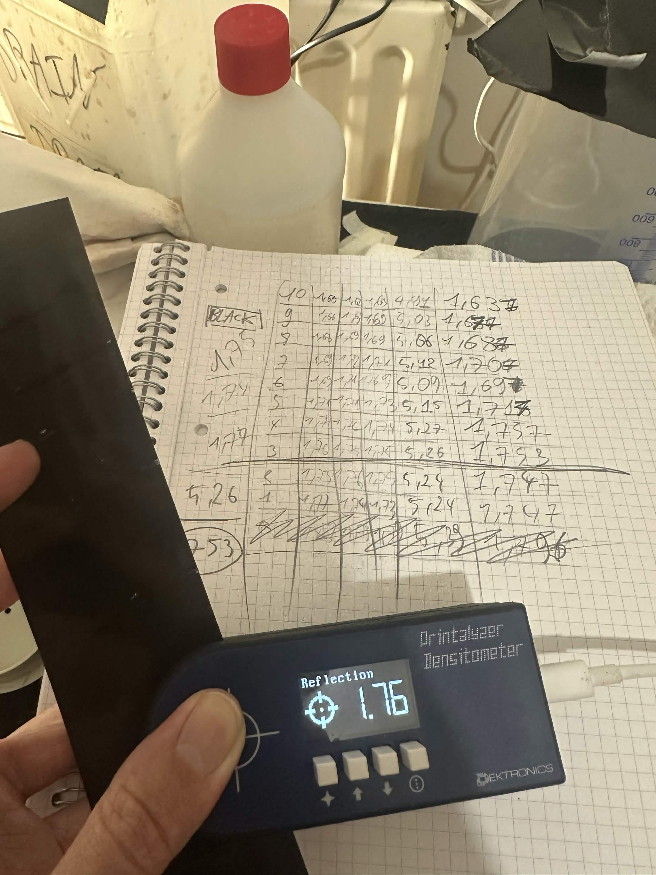
Taking these 3 samplings and averaging them, I decided to keep 4 significant digits per number (rounded) just to have something to compare
The goal is to find where the density of the unexposed pure black (that was about 1.753 OD) was higher than the exposed paper. In my case, this happened after 3 seconds in the condition my enlarger was set up with.
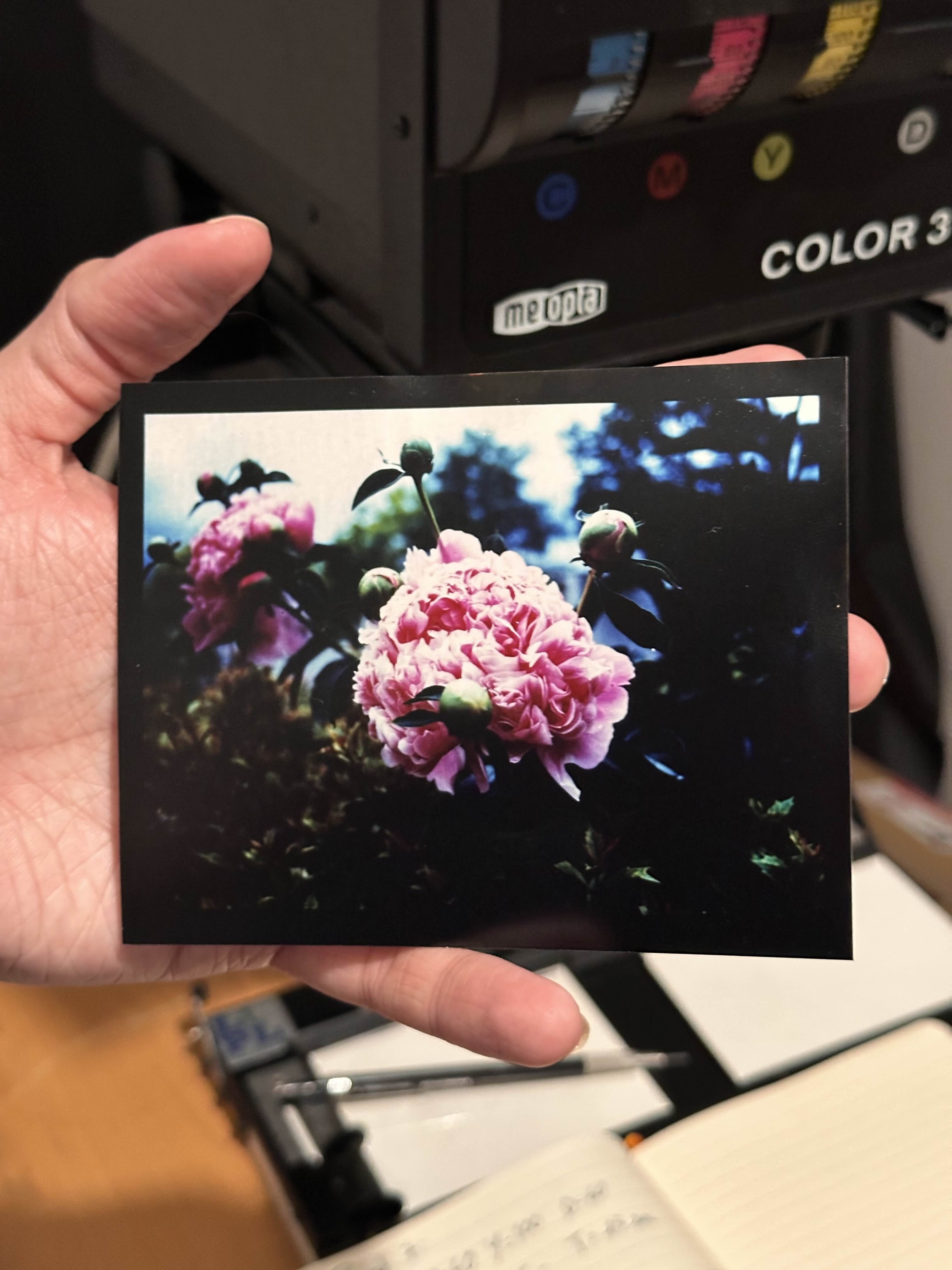
Applying this method, it seems that the pre-flash exposure has an effect on the colors of the shadow tones, while the correction done to the slide exposure mostly affects highlights.
From applying this method of pre-flashing, I was able to get the following result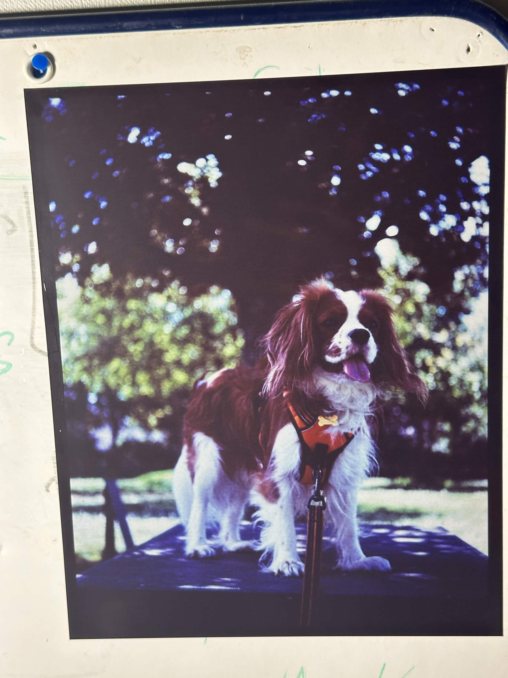
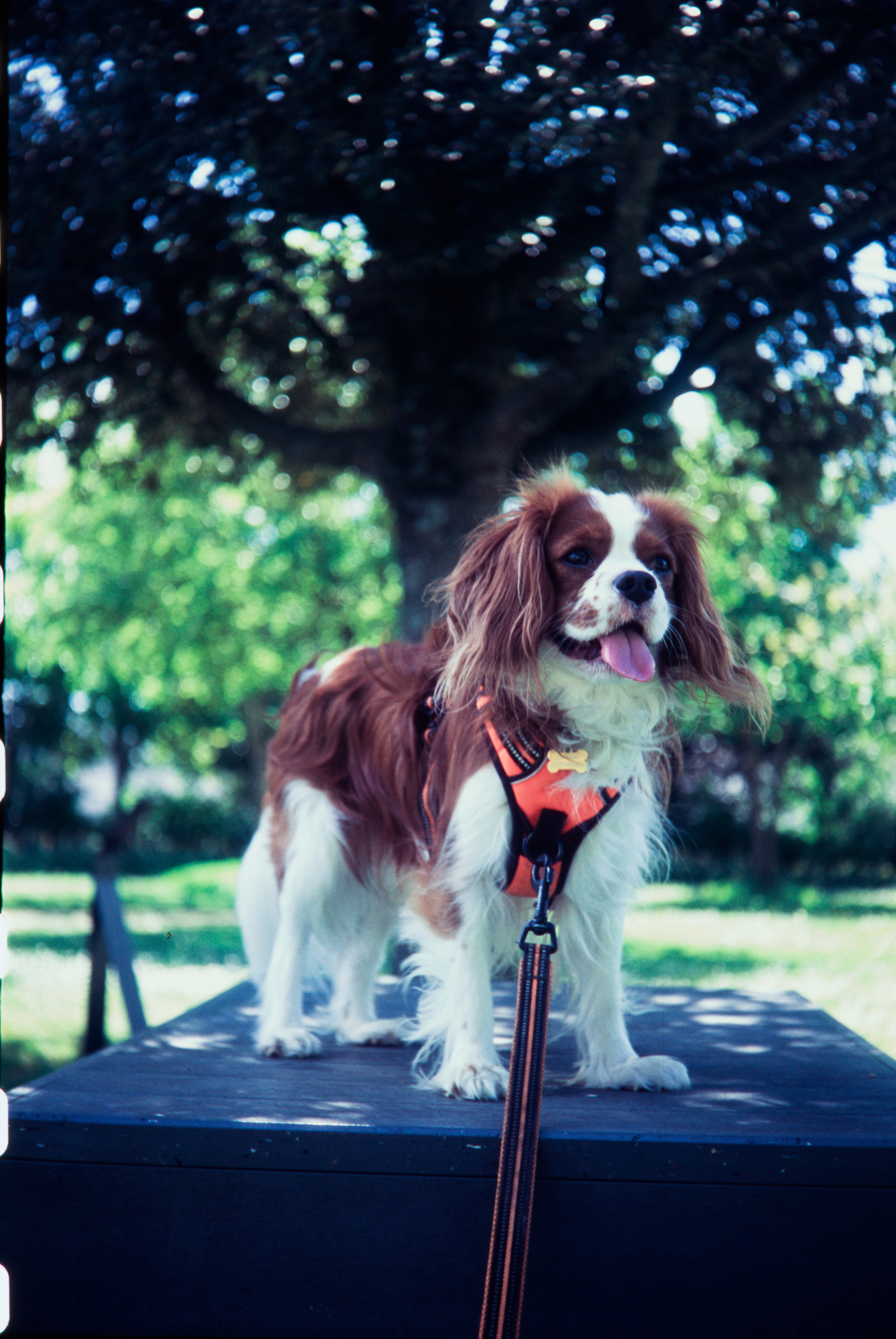
This is far from perfect, and I have not got the color correction perfect, notably in the shadows. This is something that should be affected by how warm or cool that grey pre-flash is. This is something to play with.
Masking
I’m working on it, and learning about it. For now… follow along the last few links in #References
The main idea is to make a contrast reducing mask that will block up the highlights of the slide. This involves making a slightly unsharp, low density, low contrast black and white, negative copy of the slide.
This is to compress the dynamic range that will be exposed on the film, and bringing the highlights closer to the dark part. This will selectively block the light where the slide is not dense, and let it through where the slide is denser.
Effectively, the RA-4 paper does not react to that many stops of light between the darkest and lightest part of the image. The slide has a lot bigger difference between the lightest and darkest part of it than the paper could handle as a negative.
And I think the reversal process is probably messing with this. I do not know if the way we get sharply into blown out chalky highlights while the shadows are still black has anything to with us being stuck in the toe or shoulder of one of these densitometric curve. And if putting it upside down does anything worse to it?
To do this, one needs panchromatic film. Black and white work can be done with orthochromatic photo material, but in the case of color work, you need to have the sensitivity to the green and red parts of the spectrum just as much as from the blue one.
The recommended film for this is Kodak Tmax-100 (Which is also sold as Kodak Ektapan 100) or Ilford Delta Professional 100.
Both of those film are
- Slow speed (100 iso)
- Extremely fine grain (tabular/core shell technology)
- Panchromatic with a very even spectral responce (will accurately copy the tones of the color photograph)
- Coated on a very optically clear plastic material when bought in sizes above 35mm
One issue with these tabular film is that a purple/pink dye is present in the emulsion. This dye is probably a sensitizing dye due to the type of grains in use (I do not know what it is). If still present in your mask, it will affect the color filtration.
The pink stain will disapear with a thourough wash. I actually recommend this procedure:
- Fix the film for 5 minutes in pretty fresh Rapid fixer. I use Ilford Rapid Fixer, but any non hardening ammonium thiosulfate “rapid” fixer should do it
- Put the film in 2/3 minute in a hypo clearing agent (Permawash, Kodak HypoClear, Ilford Washaid)
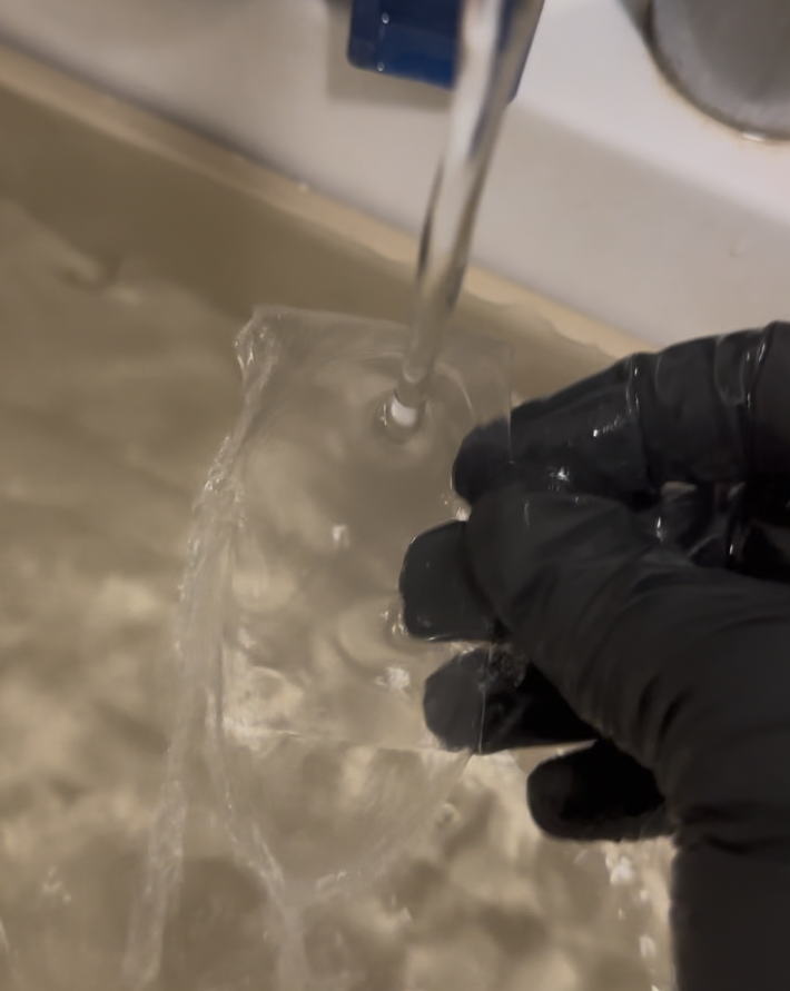
- Rinse the film under running water for 5 minutes or more. Running water directly on the emulsion, in a tray, has worked great for me
The exposure and development of “camera film” in the darkroom under an enlarger involves working with pieces of film in total darkness, and for development. There are no safelights you can actually use (maybe an extremely low green one, but I do not have that.)
I first tried developing the film in a tray using HC-110. I’ve done both relatively normal (1+31) and high dilution (1+61).
The 1+61 dilution, which is not something planned by Kodak, worked relatively okay, but quickly became inactive, probably due to oxidation of such a low power developer open in a tray for a few hours.
All my subsequent testing was done with with HC-110 dilution B (1+31).
The development of black and white film in this way occurs in the same way that black and white paper does. To avoid becoming absolutely mad in the total darkness while doing so, I suggest you find something ticking so you get an idea of the passage of time. It is probably a good time to listen to audiobooks or podcast. Or anything that will make agitating a little bit of film in a tray without even being able to see how long you still have to do it bearable!
My initial test is running with just a cheap piece of glass from a picture frame as a spacer. Here’s the contraption built to expose masks:
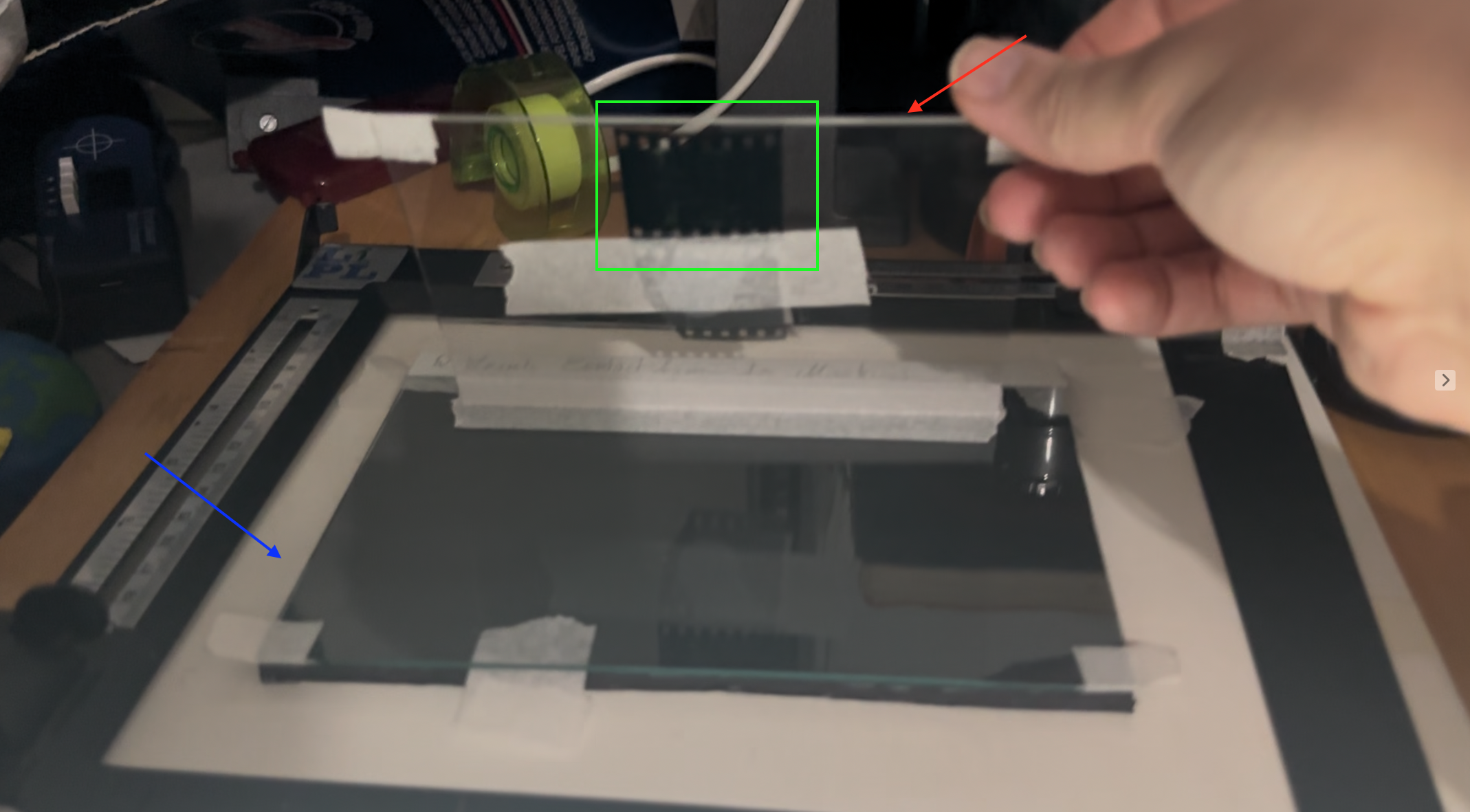
This is how it goes, in Green this is a slide, tapped on the interior part of the top glass sheet (the sheet pointed in red). The negative to be exposed by the enlarger light will go, emulsion up under the bottom sheet of glass (pointed in blue)
These are the first attempt at making masks with this setup. They are not yet perfect and they were done slopilly just to see if I was able to not ruin the film.
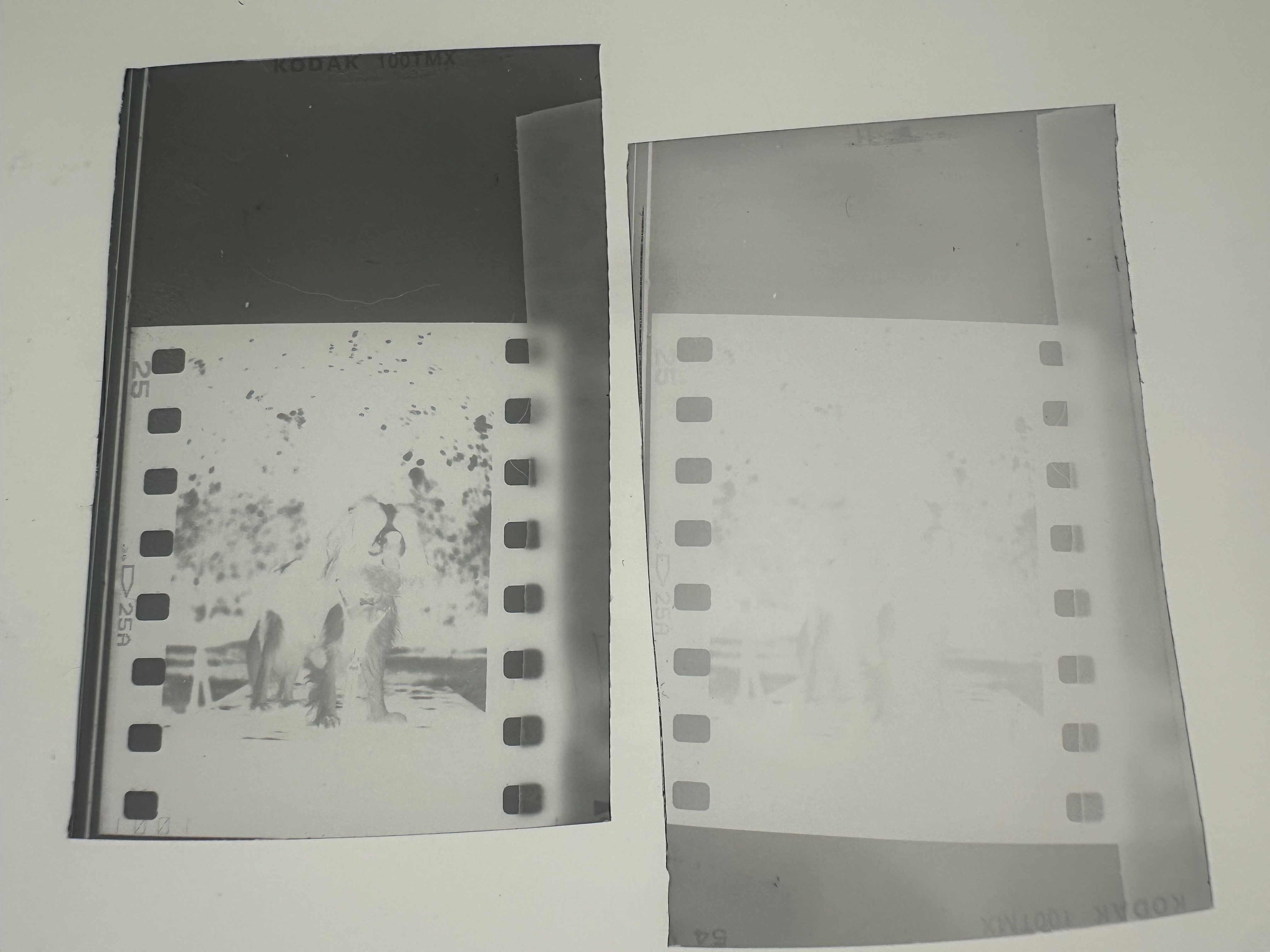
I cut 40mm long pieces of film out of the non taped end of a roll of Kodak TMAX 100 in the dark, These were exposed to 1 second of white (not filtered) light from my enlarger using the above setup, with the lens closed at F16, the 2 ND of built in filtration enabled, and just 1 second of exposure.
These were the same exposure, they were developed in HC-110 dilution B. The very faint one on the right is probably useless and was developed for 1 minute, the 2nd one is darker and was developed for 3 minutes.
The optical density of the darker test is only 0.48m which is under the recommendations from Ctein’s book in the #References where he recommends to target a maximum density of 0.6
On top of that, the question of controlling the contrast of this mark is yet to be put to test. As usual, the answerer to this is dependent on the amount of exposure, the amount of development, and the choice of developer.
References
- Christopher Osborne, for Silvergrains Classic, Improved RA 4 Reversal Printing – Jeff Neale, https://silvergrainclassics.com/en/2023/02/ra-4-reversal-printing-jeff-neale/
- Gregory Davis, RA-4 Printing, pt 3: Print Ring-A-Round and Contrast Control, Chapter “Low Contrast” https://youtu.be/q_TpHwYAxto?si=jNTUTo39SWUKKA7c&t=726
- Gregory Davis, Preflashing RA-4 Color Darkroom Prints, https://www.youtube.com/watch?v=lcx4ag7iygI (Noting that the above methodology will not use a negative orange mask, and will look at a reversal development. Goal is to keep the paper black, not keep the paper white)
- Post Exposure 2nd Edition Illustrated, Ctein, Chapter 8 “Contrast Control in Color”, book now freely available at this URL https://ctein.com/booksmpl.htm
- (in French) Bonavolta.ch, Masques argentiques, https://www.bonavolta.ch/hobby/fr/photo/mask.htm